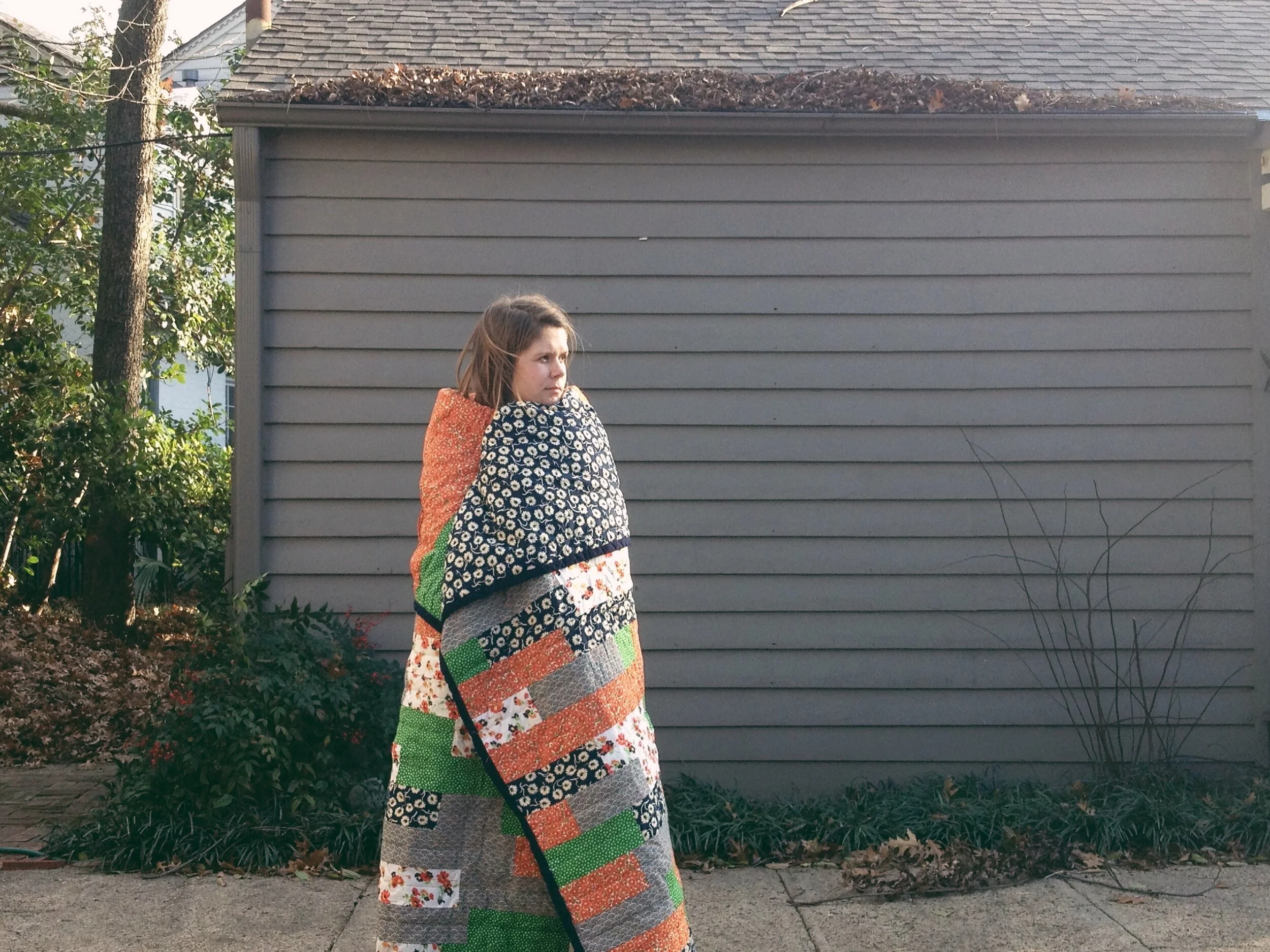
Why Solid Colors?
As you may have noticed, I primarily use solid colored cotton and linen in my work. There are a few reasons for this, some inspiration-based and some aesthetically-based, but it's absolutely not a hard-and-fast rule for me. Just what I prefer and what I immediately gravitate towards.
Confession: my very first quilt was ALL prints.
After much internal debate, I had finally decided to go ahead and make a quilt, but I didn't have any fabric, so I went to the nearest Joann's in Rapid City, SD (we were 8 months in to Airstream life and happened to be visiting Mt. Rushmore that week). I had no plan, no design, no vision and no idea what I was doing. So I stood in front of that wall of fabric for over an hour (I'm frustratingly indecisive), grabbing different bolts and seeing what looked "good" together. After too much time and energy wasted on bad fabric, I settled on an excessively busy combination of navy, lime green and orange patterns. Why I didn't even consider using solid fabrics, I don't quite know.
I learned a lot of lessons with that first quilt (like do not attempt hand-piecing a quilt...) but my biggest takeaway was use patterned fabric sparingly.
Baby’s First Quilt
While nearly every quilt I've made since then has been made with solid colored fabric, I have incorporated some patterned fabric into custom quilts and all my collaborations to date have used high quality hand printed cottons (like Sara's indigo Katazome fabric and Little Korboose's screenprinted tea towel scraps).
But I use solid colored fabric because the colors of the landscapes that inspired my work make more of an impact in my mind than the patterns and textures. Driving through the Presidio in San Francisco, the terracotta roofs and the evergreen cypress trees and the rust-colored Golden Gate Bridge stood out more than the pattern of the roof tiles or the texture of the foliage. And I think when it comes down to it, I'm more interested in distilling the shapes and patterns of a landscape into their essential, most basic form to create a symbol instead of a direct representation.
The Presidio Quilt
And aesthetically, I find solid colors more timeless and universal. They won't look dated in 40 years, the way that 70s floral looks VERY of its time, or be gender specific, the way ditzy floral is so feminine. Solid colors complement the boldness of the shapes and let the overall design shine through, as opposed to the fabrics overwhelming the quilt pattern.
So while you won't find me using patterned fabrics often, I'm absolutely open to using them (sparingly of course), especially if they're hand printed, naturally dyed, block printed or woven by hand. There's something so luxurious and feel-good-y about working with a beautiful fabric that an artisan has lovingly handcrafted. I'm thinking of adding in some handwoven ikat and block printed fabric from India next...
What are your thoughts on solids vs prints? Any favorites from either camp?


